Showing posts with label manuscripts. Show all posts

21 August, 2011

It's done so I can share a Midsummer Knight's Comic....?


Some goddesses are puzzled by this...like me...

Text for the Herald
Let it be known that We, Thorin, Dread Sable Lion, and Dagmaer, Fair
and Gracious, Sable Lioness have Created to the Rank and
Dignity of a Knight Our Trusty and Well Beloved,
Lourenço de Compostella and have made him the same on
account of his Chivalry and Prowess upon the field. Let all An
Tirian hearts rejoice as a new made knight and member of Our
peerage stands forth.
In witness of this day do we set our hand and seal on the  __________
day of August Anno Societatus 46.


The scroll design was done by HL Sannan the OneEyed of Hauksgarðr
Design based on the Galician  13th Century Manuscript
Las Cantigas de Santa Maria Chansonnier
primarily elements from Codex E but elements from Codex F (the Florentine Codex) were  used as well as both were similar stylistically 


The reduction in size from the original 35X50cm or 14X20" was due to the size of hot press paper I had on hand.


 The color choices were based on manuscript color choices/schemes for borders and non-story elements
Other color choices based on reality and or arms of individuals involved. ;) M.Graham designer gouache was used for paint with colors being matched as closely as possible to those seen online in the Cantigas. Metals used were all sumi ink by yasutomo and were applied first and burnished.

This manuscript is considered by many to be one of the earliest forms of comic 'book' and as such, tells many 'stories' http://anthropro.blogspot.com/2010/11/medieval-comic-las-cantigas-de-santa.html
the story of this scroll is Lourenço's SCA journey to this point from the OP and his own words.

The first two frames are the AWW  July 2003 where he and the now Sir Godric ap Rhys (colors Sable and Or) held a bridge against an overwhelming number of opponents from the West. Lourenço was known as n and was awarded the Fury of the Lion for their courageous last stand at the bridge.

I messed up the order of the frames a bit when I was doing my cartoon under-drawing for this...but light boxes are wonderful things...

Next Ejulfbjorn makes the journey to 3 Mountains from his home in Glyn Dwfn, where he learned under the tutelage of Duke Sir James Greyhelm (the blue dragon wings on the boat to guide him and the 2 silver spears and the silver and blue shield in the viking boat) and Sir William Brennan (the black and red shield in the boat). Lourenço's own axe and shield are in the boat as well. Everybody I consulted liked the waves under these boats that were a very dark indigo with white swirls. But, of course, as Ejulfbjorn, was NORSE when he first got to 3 Mountains before his personna change, I HAD to have him arrive in a Norse ship with the proper warlike accoutrements from the people he had been learning from.

Next Lourenço is seen as his incarnation as a Stormgod, the Barony of Stromgard's defender, (with the white horse of his knight William Brennan in the background.) he is shown in the Eric in his own armor of his colors with his inspiration watching. In my cartoon above, this is in the second square. In the final it is in the 4th square. On Facebook I posted the pictures Lourenço sent me of his armor, himself, his lady and his banner so I had a chance of making some of it match his actual stuff. I checked the armorial for the James Greyhelm listing and Lourenço sent me the information on this first knight, William Brennan, so that his horse, and colors, could be added to the scenes. He sent me the link on Godric ap Rhys as well so I could add his colors to the bridge battle.

Checking the OP, I discovered when he was awarded the King's Favor and his AoA and so could try my hand at small likenesses of Tiernan and Miranda. They aren't great, but hopefully aren't insulting and they get the spirit of the point across. The last panels are Lourenço after he received his King's Favor from King Tiernan, also receiving his Award of Arms from King Tiernan and Queen Miranda.

And in the final panel, Lourenço is put on vigil and is seen in a vigil chapel with his head bare and his weapons outside the door. The shield division was taken from Lourenço's device that is in submission, as are the colors of the surcoat. The surcoat style is from the manuscript. The wolves and bears at the box crossings are from his proposed arms. The banner on the historated initial is similar to one he carries in reality as a war banner.

I sent a few links with the information about the scroll so if the recipient was interested he could do more research:  http://www.edilan.es/hojas/0002e.htm
http://www.library.arizona.edu/exhibits/illuman/12_08.html

And I added a few cautions from scribes I've learned over the last few months. :D
This scroll is hot pressed paper and a water soluble paint with waterproof ink, 
BUT please,
realize  over 20 hours of research went into its creation, 
                       plus 6 hours of calligraphy
                       plus 15 hours of underdrawing
                    then an additional 70 hours of illumination (painting)

That is over a hundred hours of an artisan's time. THIS artisan's time...Whether you like, hate or are indifferent to the product, 
please don't:
fold, roll, or sit on it where other scribes, or I, can see you do it....it discourages us all, and makes us all feel unappreciated
sweat, drip, cry, or let rain hit the paint. It will smear and ruin the painting and all those hours will be for naught.
Please don't store it on a dashboard in the sun, the wax on the seal will melt...but it will ride home there fairly well. ;D

Please do: hold it by its edges, keep in an envelop, and if you don't want to frame it...give it to your mother....maybe she'll want to frame it? 
Nothing made me want to wince more than seeing original works of art thumbtacked to a wall, or folded and slid under the recipient's rear for safe keeping.

Congratulations Sir Knight, and I hope you enjoy,

Lady Sannan the OneEyed of Hauksgarðr

I'd already managed to bung it up enough just because of my constant fight with depth perception while I was working on it. Just 2 more weeks would have been a luxury. I'm feeling whiny. My eyes are a constant burn and ache now. So bad I can hardly sleep. And my left arm, the one I haven't been able to afford the surgery on yet, was holding my ink bottle and managed to spasm into me juggling the ink bottle right over the top of the scroll in the last two days of production. Not just once, but twice.

I know it's just that I take on commissions as if I'm not disabled anymore and then act like I'm not and my body rebels. It's rebelling now. The pain hasn't climbed down the scale far enough for me to really sleep since I finished.


And here, my covering paper slipped while I was doing the flourishing Batarde Initials...The paper that is SUPPOSED to protect from stuff like this...and caused this by slipping into wet paint and carrying it into the margin. That little red blotch. There were a few other blotches by the calligraphy, but I expect those, cause I'm not so great at calligraphy. So one of these days I'll have a perfect product and have to find something else to bitch about. ;D
 I know better. I just felt so honored to be asked. I don't seem to get asked to do things very often so I hate to say no. But I need to learn that my body can't live up to these kinds of demands. My eye gave out 2 days before the scroll finished and so I had no depth perception trying to finish. Luckily the main calligraphy was done or I would have been toast.  As it was, the hand spasms caused some bobbles that wouldn't have happened it I hadn't been so tired that I had to push it. If I hadn't had to wait so many days up front to start. If I'd known even 2 weeks sooner it would have been much cleaner all around and I would have been much happier.
This has the ugly black ink bobble at the lower corner.


This is the same spot. It didn't clean up that well. Hopefully it will be matted and framed.

The worst of the bobbles he probably will never notice unless he, or someone else looks. They will be under a frame or matting edge. Others, I will always notice, I'm a scribe....gee, I will always wish I just would have had time to do that....
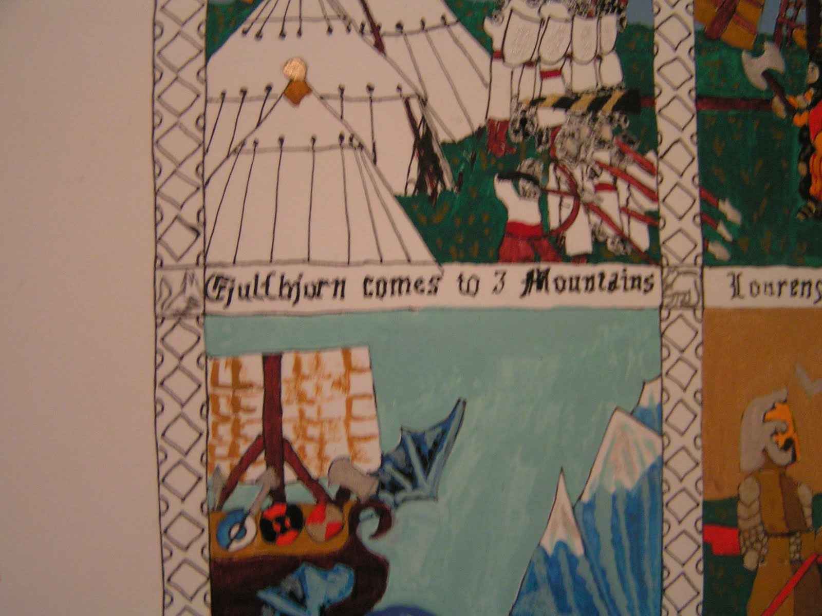
In this one my pen came down into the ship caption from above.
The pen marks, the ink, the paint..the bobbles, it's all part of it and there are ways to fix almost all of it so I didn't have to start over luckily, because I didn't have the almost 100 hours of time to devote to the project again.
The red splotch cleaned up fairly well.

I got thinking about it....how many armorers devote 100 hours or more to how many suits of armor they build? How often?  I know many scribes who put in this amount of time in research and honing their skills regularly. Others who don't as much, who just trace and paint, not as much researching into the era of the client, but wow....we're insane....   Maybe some of it is I just don't paint or draw that fast. ;D

My FB portfolio
My FB charters- medieval illumination I have done on other's designs

from an insanely puzzled goddess

16 August, 2011

Next time I agree to this short of a timeline....shoot me....

Some goddesses are puzzled by this...like me... I always let the helium float that hand up and say yes. I know better. Dayam. I knew better when I did the 2 charters for Stormgods. It burned me out for weeks. My disabilities and helium hand do NOT mix. There's more than one reason I had to stay home from Stormgods.

I knew better this time. But I'd promised Eleanor a charter for this reign and it was ALMOST done...not quite...so the guilt hit and I figured, (and Kerryk said, "you've got 4 weeks"). So I said yes to my first Kingdom commission scroll. The knight was put on vigil at Stormgods and was to be made a peer at Sport of Kings.

I said yes.  Then I was a dumb ass and double checked Kerryk and the calendar and discovered that there was less than 3 weeks to get it done....oh, shit. So I quickly read through all those notes I had from all those classes where the experienced scribes tell you what to do and who to contact. And I sent the emails out and waited for responses....and waited.

Checked the OP and the armorial and didn't see any arms so I talked to the Wrangler, but the candidate seemed to think it would be just fine to use his arms since they were in submission and he'd been told they were sure to pass and he had received a "letter" about his name.

2 weeks later I got the final word after contacting and not hearing from Lion's Blood. Even though the Scribal procedures call for scribes to get wording approved through Lion's Blood...Lion's Blood doesn't want to see it, and since Lion's Blood needs to sign all blazons and emblazons they do NOT want any scrolls created with out PASSED devices or names or they WON'T sign it, PERIOD. I didn't get the courtesy of this response, but at least Sable Sable did...It should be fun the NEXT time somebody tries to actually follow the scribal procedures as they are written in the scribes manual...hmm....guess not too many people do....or maybe too many people are and Lion's Blood is getting inundated. (I never checked back emails on the scribal list to see that THIS Lion's Blood didn't want to see scroll text. LOL So I could have gotten four days of that time back for myself if I'd just remembered that email going out awhile back, but I'm too forgetful, I always go back to the manual.)

Anyway, requests for info from other sources besides the individual himself were woefully lacking in information and uninformative. I was glad the people weren't talking about me. I got essentially "He's a good fighter, has won this award and wears armor this color." Wow....somebody told me he was really tall and he was a really sweet guy. Not a great deal to go on when you are trying to personalize something to make a memory for someone to last a lifetime. Luckily his Wrangler knew more, and since it wasn't a surprise, his Wrangler put him in contact with me and I could get some info out of him to add to the mix.

In a few days I'll post some pix of the scroll and how it went. Design inspirations, and all that so people can follow the thought process and see what a pain it is and how many mistakes are made when you can't take breaks when you are tired. Or when your one working eye is over strained and you are losing your depth perception. (I really am earning the OneEyed title lately!)

But it will have to wait until it's done....and after it's been awarded....at Sport of Kings...which I won't get to see. Hopefully, someone will get a picture.
from a puzzled and tired goddess

19 December, 2010

Cool library in Wales...

Some goddesses are puzzled by this...like me...
or not puzzled...loving it....Welsh libraries...manuscripts...illuminations....oh I would so love to see these for real!
The National Library of Wales - Alexander the Great MS 15c

from the goddess of learning

06 November, 2010

Floriography---or not, Botanical Symbolism in the Middle Ages

Some goddesses are puzzled by this...like me...
Presented by HL Sannan Cairngorne of Hauksgarðr
October 9, 2010

The Victorians called it Floriography. We call it the "Language of Flowers." To the Ancient and the Medieval mind, it was their gods, or God revealing himself or herself to them. We have fairly standard lists of meanings nowadays between the internet and florists. Victorians used to carry lists around with their meanings and they could vary from city to city and country to country. It wasn't much better in medieval times, but there was a bit more agreement on what meanings were attached to certain flowers and what they represented or who.

The use of botanical imagery in painting proliferated especially in the fifteenth and sixteenth centuries, as artists became increasingly interested in the realistic depiction of objects from the natural world; the purpose of this imagery was often, however, twofold. Beyond their decorative properties, plants and flowers usually had a symbolic meaning or association that related to the subject of the painting. Thus, a plant could be depicted either as an attribute, giving clues to the identity of the subject or sitter (as in 43.86.5), or as providing a moral or philosophical annotation on the subject.

Botanical symbolism has its origin in the literature of antiquity, where plants are often used in metaphors for virtue and vice. In classical mythology, human beings are transformed into plants as a reward or punishment, as in the story of Narcissus, the vain youth who fell in love with his own reflection and was changed into a flower that bears his name. Certain plants are also mentioned as attributes of gods and goddesses: grapes for Bacchus, god of wine, and corn or wheat for Ceres, goddess of agriculture. Classical texts on farming and natural histories by Pliny, Cato, and Lucretius also recorded some of the traditional lore associated with plants. Many of these ideas and associations were passed on to scholars and artists during the Renaissance, a period of revived interest in classical texts.

Religious writings also provided a wealth of plant symbolism. The Bible and the Apocrypha contain many references to trees, fruits, and flowers in moralizing similes and parables. The Song of Solomon is particularly rich in allusions, as in a verse proclaiming "I am a rose of Sharon, a lily of the valleys," possibly referred to in Procaccini's Madonna and Child with Saints Francis and Dominic and Angels (1979.209) by the inclusion of a vase of roses. Christian writers from the early medieval period through the Renaissance also used botanical imagery as a means of explaining and interpreting religious beliefs.

A third major source for plant symbolism was the medieval herbal. Herbals described the natural properties of plants, the method for their cultivation, and their use in cooking and in medicine. These properties, as well as the plant's shape, color, taste, smell, and season of blooming, usually lent themselves to a moral connotation: the poisonous hemlock represented evil and death, while the clover, with its three leaves, was a symbol of the Holy Trinity. Used also as a salve against snake bites (according to Pliny), the clover was sometimes regarded as an emblem of Salvation, where the bite represented Original Sin, encouraged by a serpent in the Garden of Eden. (1)

There are hundreds of examples of botanicals in artwork in the middle ages. Looking at it again with a fresh consideration to another layer of symbolism or meaning that the artist meant for there to be extant in their work brings more depth to the appretiation of what the emotion is they are trying to convey. The following pages are a table with a few flowers to give you a start at identifying some of the flowers and herbs that might have some meaning when you are looking at a work of art and just might be telling you a lot more about what the artist is trying to say.

Related research:
Source: wikipedia: http://en.wikipedia.org/wiki/Language_of_flowers
http://www.nga.gov/exhibitions/flowerinfo.htm
http://www.metmuseum.org/toah/hi/te_index.asp?i=16
http://www.earthlypursuits.com/FlwrsPer/FPtitle.htm
http://www.earthlypursuits.com/FlwrsPer/FlwrSent.htm (list of meanings from 1840's)
http://www.victorianbazaar.com/meanings.html
http://www.thegardener.btinternet.co.uk/flowerlanguage.html
http://www.terrafolia.ca/flower-dictionary.html

Period source referenced by marygardensmain.html site for botanical naming in Middle Ages
"De Plantis A Divis Sanctisve Nomen Habentibus" by Johannis Bauhin, Basil, 1591

01 July, 2009

Other people paint the same ones...

Some goddesses are puzzled by this...like me...

It seems puzzling, but it's not. It's actually very fun to see other people's takes on the same artwork and how they finish it. One of my SCA buddies found another SCAdians links on Flickr and I've been out there looking at her stuff. What makes it even cooler is that it's someone I know. I took a begining charter making class from Mistress Leah with her.

Bopping through its neat to see what she's done, especially this one! When I painted it I had a bear figuring out the shadow play on it!
http://www.flickr.com/photos/9361067@N04/2263495297/?addedcomment=1#comment72157620807739514

Here's mine! Which, of course, I like better, ;D, but the reason was more that I liked the three dimensional effects that I worked to get on the architectural detail. Not for any other reason.

You go Kewpdx! maybe sometime I'll actually be able to join the other Portland painters when they get together instead of painting up here in isolation with my mom and my daughter and trying to interest EVERYBODY ELSE! lol OH the plans I have for future classes! LOL!

16 December, 2008

I promised a look at how it went...

Some goddesses are puzzled by this...like me...

For those not interested in Medieval Illumination, ignore this post.

I started this scroll months ago, when I knew we'd have to make some kind of quasi-official request of Three Mountains of their patronage. I asked on Known Worlde Scribal lists about wording, and got no good answer so I proceeded to deal with it myself.


"Unto the Most Noble Alfric and Jill, Baron and Baroness Three Mountains do the peoples on your eastern borders send you greetings on this 13th day of December, Anno Societatus XLIII, being 2008 in the common era.

We seek the boon of your kind patronage as we attempt to strengthen our great kingdom, An Tir, by building a canton on your eastern border in the counties of Hood River and Wasco.

In support of this we do make our marks as the people of the incipient Canton of Haukesgaard, do the heralds deem it meet.


(Marks:)
HL Kerryk Wolfram, Rebecca C. Graham, HL Sannan Cairgnorn, Ashayet, Meredith Elizabeth Walter, Juliet duBlunt, Elfwyn, Hayley Graham, Steven Graham, Matt palmer, Cedryk Farskyes, Meg Lethel, Connor Cameron Hawk, Epona of Vanir-Law, Casandra O'Dell, James Douglas O'Dell, Elfwyn
"


I took inspiration from 3M's website where they were using the Grand Heures of the Duc de Burgundy (if I remember correctly. It's either the grand or the Belle. He commissioned MANY books of hours.) So I knew I wanted to place it somewhere in the Gothic time period. (Well beyond my own personna's time!) So...I looked through my scribal books and came across a discontinued library copy of a facsimilie production of the Hours of Catherine of Cleves (c. 1440) I won't bore you with the background of how they dated the manuscript, etc. You can read the book or ask me, if I remember beyond yesterday. *grin*I knew that I wanted the elements of a hawk (heraldically an eagle with jesses it seems like), 3 mountains (for the representative barony), a deep valley or gorge and a keep. All of these elements are part of our heraldry for our group, and I wanted to represent the group.

I had the drawing of the winner of the 'best representation of a hawk,' from May Revel last year (yes, we've been working on getting this together for almost 2 years!) and I wanted to use that so that Meredith(Missa) would still feel included in spirit though she's travelled afar from us in body! This also pushed the era beyond mine, into one of more realistic looking miniatures.

So, materials choice. I can't currently afford true vellum, so hot press art paper of 90-120 lbs is considered an appropriate substitute. I think mine was Arches 110lb press. I used a quarter of a sheet to get the scroll to be a good size for matting and framing without special orders.

Gold choice. Gold is a large part of this piece, but I can't afford patent or leaf gold currently to do gilding or shell gold for painting so I had to be satisfied with the use of Sumi Gold Watercolor Ink.
I used Winsor-Newton designer goache paints and one or two colors of M.Graham designer goache.

I first created a cartoon on an 11"X17" piece of graph paper, cut down to 11"X15". I drafted out the margins, the calligraphy and letter blocks, the vine margin area and the central picture area. The margins on the left in the original are larger, since it was meant to be bound into a manuscript, I tried to keep that look. Also, the upper margin was smaller than the bottom, again I tried to keep the look.

I didn't want human figures in the border of this so I replaced the seated monk with some additional acanthus leaves and a bird in the border. My scroll isn't an exact match on purpose, just, "done in the style of."

The picture was sketched in on the cartoon and the text spaced. I did forget to draw in a frame around that actual picture, which I would correct if attempting this style again. I would also allow more spacing in the calligraphy. But this was the first time I'd tried this hand, so the results were acceptable, if not great. ;)

Since we had people showing up at many different times to sign this thing, I had the signatures placed on the scroll before the wording was calligraphied. They were shown the cartoon with the final wording and design so they knew what they were signing.

I also proceded backwards from most in that I did the calligraphy before the illumination, since I was much more comfortable with my illumination skills than with my calligraphy skills on a brand new hand. :)

I had a delay in the middle of this process when I lost the majority of the sight in my left eye due to the liquid separating from the cornea, supposed to get better sometime soon, but I got to the point where I couldn't wait for that. So, this was finished by a one-eyed scribe. :)

I transfered the design from the cartoon to the actual scroll via lightbox. Then I worked the calligraphy. I didn't feel up to the challenge of breaking down the form of gothic used in these hours and coming up with my own ductus, so I went to Marc Grogin's book and used the Gothic Textura from the period involved. My paleography is not quite up to doing it myself yet. :)

I kept my color pallet small and bright and close to the colors in the original. Spectrum Red and Grenadine red highlighting, Pale cadmium yellow, Ultramarine Blue, Sap Green, Burnt Umber, zinc white and titanium white.

This is how the final scroll turned out. I won't point out any more of my mistakes, but gee it was a learning experience!

from a puzzled goddess who went medieval all over a scroll :)

22 September, 2008

Charting into medieval waters ...

Some goddesses are puzzled by this...like me...

I'm procrastinating, badly. I realize it, and I'm trying to stop. I've had a place in my neck that's been out pretty badly for the past 3 months, and it makes it pretty easy to have an excuse to procrastinate. I have many charters from Kingdom and Summits that need to be painted. Luckily, my mom-in-law isn't as much of a procrastinator as I am. :)

I used to think I could maybe develop some kind of artistic capability. Not at expert level mind you, just enough so I didn't embarrass myself or my family in a public venue.

I'm not so sure about that any more. I've spent the last 10 or 11 months very religiously studying medieval manuscripts, illumination and calligraphy and still know that I've only just touched the surface, but I thought I'd got some of the basics of painting down. I've been practicing and reading books, cuz I never took an art class until that one drawing class with my hubby about 10 years ago.

I recently was told that my stuff was too dark, and that I didn't have the skills to do the designs in a clean and medieval manner. I was a bit disheartened. The feedback is nice. I like to know what I'm doing wrong. I just don't think now that I can do anything right. I really would like to be told how to correct individual things, not blanket statements. But I guess that any feedback that's not 'gee how pretty' in a volunteer organization is getting you somewhere. Maybe?

I just have a hard time having any confidence in this, since it's not something I've done before, but I so enjoy painting. I guess I'm hoping that if they hate them bad enough they'll tell me not to paint so that I can stop wasting my time? :?

Here are the charters that were particularly dark, too dark for kids anyway :)
Have to remember to use something besides Prussian Blue and Black for a base color in the picture elements, huh?

I think the charter from this bunch that I was proudest of was this one on the right....I REALLY wasn't sure what that building was I was painting, or how it should be shaded. I was impressed that it actually came out looking like a building! :)

The other one I outdid myself on in my opinion, is the one at the head of this post...my sister was the scribe of the Summits and gave me two of these to paint in a Trompe l'oeil effect...needless to say, I had NO clue what that was until it was explained to me. :) The green as a background worked out fairly well, better than the gold I tried on the first one I did!

So, now I have talked myself into doing some more painting...maybe.

from a puzzled goddess

29 August, 2008

Chunks out of time and scotch tape...

Some goddesses are puzzled by this...like me...

I remember hearing about the Dead Sea Scrolls when I was a kid, but I never had much of a clear idea of what they were. Yeah, they were written by dead prophets, a long time ago, and were translated on and off by scholars...so?

[my dear husband, philistine that he is, just loves the quote about the scripture written by a bunch of old guys in a cave smokin' rope, but we leave him his illusions...it's better that way. *grin*]

NOW that I'm MUCH older [don't agree with that too loudly!] , I understand the extreme sense of history and wonder in having 15,000 fragments that make up some 900 scrolls that are over 2,000 years old!

2,000....hmmm I doubt any of our ramblings on the internet will be around that long. :)

The neat part about this now is that the Israel Antiquities Authority is currently working to digitize these irreplaceable pieces of the past and place them on-line for everyone to see. There is an article on The New York Times website about it.

The part that made me grit my teeth was finding out that the original "experts" in the 1950's who were trying to piece these scrolls together used scotch tape to do it. Ouch! Anybody who has old records with crumbling pieces of scotch tape on them knows what that glue does to the paper. I have some pictures from the 50's and 60's that were pretty much ruined by the discoloration.

Seeing these eventually on-line is definitely something to look forward to.

from a puzzled goddess geeking out on the past

RANDOM READS FROM OUR FAMILY LIBRARY